
Spicing Up Your NAV 2013 Pages
Editor’s note: The following blog was originally posted on January 3, 2014. Two of the graphics were incorrect. The blog is being reposted with the correct graphics. We apologize for any inconvenience. If you have any questions, please contact ArcherPoint at emartin@archerpoint.com.
I recently had to make a lot of chili. I mean, I made 16 QUARTS of chili. It was for a fundraiser at my church to benefit our youth group.
At the chili dinner, I noticed something odd. There were three pots of chili. Two pots were mine, and they were emptied very quickly. The third pot, which was much bigger, was still near full when we finished serving. The next day, because we had leftovers, we served lunch after service and we all ate leftover pimento cheese sandwiches and that big pot of chili. Once I tried the big pot of chili….I knew.
The thing about delivering flavorless chili is no one is going to tell you, “Dude, you need more spice in your chili!” You did what was asked. You made chili. But the satisfaction level isn’t there. The same is true sometimes when we deliver code modifications or new functionality. It may work, it may do all it’s supposed to do, but it doesn’t delight and impress the user. It just fulfills the requirements.
NAV 2013 offers some fabulous ways to spice up your pages.
Using Style as a Visual Signal
Visual signals are a quick way to get a message across to the user. Pages offer us a wonderful way to do this with colors and bold text. You may have noticed on the Customer Ledger Entry page that when an entry is past due, some of its fields appear in bold red. This is done using STYLE and STYLEEXPR properties on fields. Here’s how you accomplish this dynamically, based on your coded conditions:
- Create a text field as a page global variable. (Since it’s a variable, you can omit the length).
- On the fields you want to affect, enter the text field name in the “StyleExpr” property.
- Create a function (within the page or the table) that will set the text value to the style you want to use in displaying the fields. (Valid styles are found on the dropdown of the STYLE property, such as “Strong”, “Favorable”, “Unfavorable”, etc… You can assign these to your fields and preview the page to see which looks most appropriate for your visual signal.)
- On the OnAfterGetRecord trigger of your page, call the function, assigning the text value it passes back to the text field you have placed on the fields.
There are many ways in which to use this type of signal. In a FIFO environment, you may want to give a visual signal on the Item Ledger Entry List when an item has been sold without a profit, which could be due to a bad inventory cost entry. Or you may want to use it on the Sales Order List page to show orders that are in a backorder status, having some, but not all, items shipped. On a Purchase Order List page, you might want to use it to make drop shipment purchase orders appear differently than orders for inventory replenishment. Think of how you can delight your users by giving them the information they need – without requiring them to look it up.
Handling Not-Always-Needed Fields
Sometimes you may have a situation where you need the user to complete more information on the page – but only in a certain condition based on other fields. One great way to do that, and give the user the signal to enter more data, is to only show the fields when the condition requiring the field to be used is met.
For example, let’s say we only want to show the Tax Area Code, Tax Identification Type, and Tax Registration No. fields of the Customer Card when the Tax Liable field is checked. Here’s how we accomplish this:
1) Create a Boolean field as a page global variable, and set the IncludeInDataset property to YES. (You will find that this is much simpler if you use the TRUE value in the name, such as “ShowTax”.)
2) Create a GROUP for the fields you want to affect with your condition, as shown below:
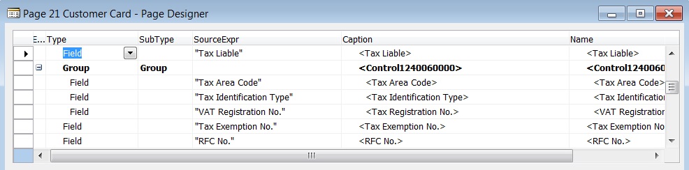
Figure 1 – Create a GROUP for fields you want to affect
3) On the Group row, set the VISIBLE property to the Boolean value you created.
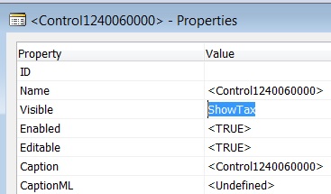
Figure 2 – Set the VISIBLE property to the Boolean variable you created
4) In the code for the page, add a single line of code in three places: OnAfterGetRecord trigger, OnAfterGetCurrRecord trigger, and the “Tax Liable” field OnValidate trigger. The code sets the boolean value based on the “Tax Liable” field setting. The code line is:
ShowTax := “Tax Liable”;
When the tax liable box is checked, the fields will appear. When it is unchecked, the fields will disappear.
Additional Fields
At other times, there may be a set of fields that are rarely needed on a page, but when they are needed, you want them to be easily accessible. NAV gives a very simple way to do this by using the Importance field property. By setting Importance of the fields to ‘Additional’, the field can be displayed when the user needs it using the “Show More Fields” drop down arrow that appears in the bottom right of the fast tab section. When it is displayed, the caption changes to “Show Fewer Fields”, and can be used to re-hide the fields.
Add a List Part – Not an Action
Sometimes it is necessary to create a small secondary table to hold information related to a master table. It can be tedious to have to locate the action from the ribbon to show the few records related to the master entry. A way around this is to use a List Part page on your master card.
For example, one of ArcherPoint’s clients, Vintus Wines, needed to store and view wine ratings, which are given by wine authorities. Since there is a one-to-many relationship with ratings to the wine item, a secondary table was needed. But by using a List Part page to show the ratings, they are visible on the item card without having to use an action to locate the ratings, and display a second page. (Notice we put this on a separate fast tab, combining all like information into one neat little place.)
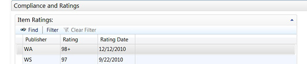
Figure 3 – Adding a List Part instead of an Action for the wine ratings example
Use Grids on Pages to Define Sets of Related Data Fields
Using a grid allows you to define the layout of related information on a page in a single area, such as the “Marketing Strategies” section below:
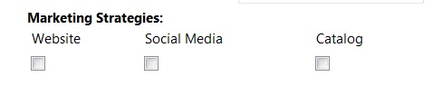
Figure 4 – A grid allows developers to layout related information in a single area
Without the grid, these would have been placed on the page on separate rows, one on top of the other. But by using a grid, we have made better use of the page real estate, and created a more organized page.
Grids have a property called “Layout”. This can be set to ROWS, indicating you are grouping data on a row, or COLUMNS, indicating that you are grouping data in a column. In the above example, we have used ROWS. Here’s how the coding looks for the page:
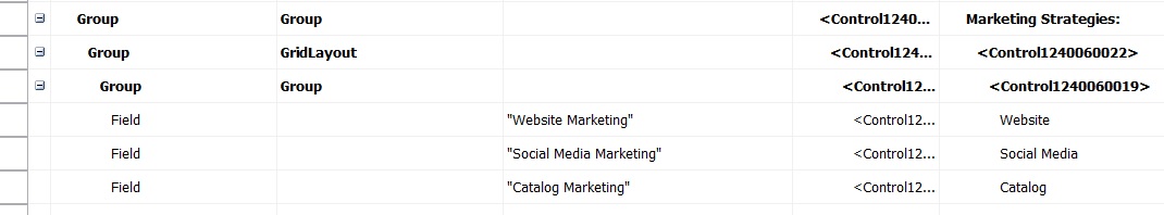
Figure 5 – Formatting and renaming content using GRIDLAYOUT
Note that we give our bolded title “Marketing Strategies:” in the GROUP row of the page, and follow that with an indented GRIDLAYOUT. We have also changed the caption of the three fields to a shorter name, choosing not to repeat the “Marketing” word in the field name on each field.
Action Icons
Every action you develop deserves an icon. Not giving your page actions an icon, or “Image” as the property is named, results in the assignment of an ugly gray ball to be your icon. Now seriously, who would want to play with an ugly gray ball? There are many images that can be chosen to fit the purpose of the actions you create. They can be seen at MSDN’s Action Icon Library. Just place the name given under the image in the Image property of the action, and there you have it! Goodbye gray ball!
Try adding some of these little spicy bits to your pages and see how delighted your users can be!
But wait….there’s more…
I have one more thing to offer NAV developers out there to spice things up! Most of you are probably like me, working from home, and often finding you have not stopped in time to make a ‘real’ dinner. Here’s a quick chili recipe that will have dinner done on time and to everyone’s liking! Start this early in the morning, and your whole house will smell delicious by dinner time.
Crock-Pot Chili Recipe
1 Lb. Lean Ground Beef, seasoned with salt and pepper and drained
1 Large Onion, Diced (I buy several, dice them all at once, and freeze them in two layers of zip lock bags so that I don’t have to cry every night over an onion!)
2 (27 oz. cans) Bush’s Mild Chili Beans
1 (28 oz. can) Petite Diced Tomatoes
1 Cup Pace Mild Picante Sauce
1/2 Cup Mezzetta Tame Jalapeno Peppers, Diced (You can find these in the pickle section of your grocery.)
4 Tbsp. Chili Powder
2 Tbsp. Cumin
Pour it all in a crock pot, and cook on High for 4 hours, or on low for 6-8, stirring often enough to be sure the beans don’t stick.
And of course, Pimento Cheese is a Southern staple with Chili. Here’s a delicious and very simple recipe to have those delicious Pimento Cheese Sandwiches as a quick side. This is best made the day before, so the flavors have time to blend.
Southern Pimento Cheese
2 Cups Sharp Cheddar Cheese, grated
2 Cups White Cheddar Cheese, grated
4 oz. Cream Cheese (half a package), Softened
3/4 to 1 Cup Mayonnaise
4 – 6 oz. Diced Pimentos
2 Tablespoons Dill Pickle juice
Use an electric mixer, and just mix it all together till it’s creamy. Refrigerate at least overnight. The recipe makes a lot, but you can half it if you want. This is delicious on white bread, slightly toasted wheat berry bread, or just spread on saltine crackers.
Trending Posts
- Login Error: Communication protocol mismatch between client and server
- How to Make Measures Total Correctly in Power BI Tables
- The Microsoft Technology Stack – What Is It & Why Should You Care?
- MRP vs. MPS: Choosing the Right Planning Approach for Your Manufacturing Business
- Guide to How Manufacturers Can Implement Quality Control Systems Using Business Central
Stay Informed
Subscribe to Communications
"*required" indicates required fields