
How Microsoft Dynamics 365 Business Central Analysis Mode Gives You Instant Answers

The everyday reporting problem nobody talks about
It is 4:15 PM, and someone from leadership just asked a simple question: “How much do our customers owe us, and how much is due next month?” You know the drill: open Customer Ledger Entries, export to Excel, trim the columns you do not need, build a PivotTable, fix the formatting, and email a file that is already out of date.
However, here is the uncomfortable truth: most Business Central users still export to Excel for questions the system can already answer. An interactive analysis workbench sits on top of nearly every list page, untouched — Analysis Mode (that’s the “Analyze” button you have been scrolling past). It is not new, not an add-on, and not an extra license. It has been generally available since Business Central 2023 Wave 2 and keeps improving with every release.
This guide covers everything you need to use one of Business Central’s top built-in data analysis and reporting tools, whether you are a daily BC user or a consultant enabling a client. Plus, you can follow along using the free Cronus demo company.
What is Analysis Mode in Business Central?
Think of Analysis Mode as an Excel PivotTable built into your list pages. Unlike a canned report with a fixed view, it lets you group, pivot, filter, and total data on any supported list without touching the underlying data, the page layout, or leaving Business Central. Every user’s tabs are personal, so it is completely safe to experiment.
The experience is built from four simple building blocks:
| Building Block | What It Does | Analogy |
| Columns pane | Adds, removes, and aggregates fields; switches Pivot Mode on | Your toolbox |
| Pivot drop zones | Row Groups, Column Labels, Values, and Filters shape the cross-tab | The PivotTable field list |
| Analysis tabs | Each tab is a saved question; rename, copy, share, or delete them | Worksheets in a workbook |
| Summary bar | Always-on Sum, Count, Average, Min, and Max across the current view | The Excel status bar |
The beauty of it is that one list page can hold several tabs: an aging view, a monthly trend, a top-customers ranking…all live, personal to you, and one click away.
Business Central Analysis Mode permissions and requirements
This is the single most common reason people say, “I don’t have that button.”
On current versions, a user needs the DATA ANALYSIS – EXEC permission set (execute permission on system object 9640) before the Analyze action appears. Most full users have it; it is sometimes excluded for limited or team-member roles.
If you are a consultant or admin setting this up, two quick notes:
- Grant the permission set to the users or groups who need it.
- You can disable Analysis Mode on a specific page via the AnalysisModeEnabled page property, not something end users control.
In version 22, it is still in preview and must be enabled under Feature Management. On anything newer, it is on by default for users with the permission.
Walkthrough: Build an Aged Receivables report using Business Central Analysis Mode
Let’s get hands-on with a classic question: “How much do my customers owe me, broken down by when it is due?” You could run the Aged Accounts Receivable report, but for a faster look, Business Central’s Analysis Mode gets you there without printing anything. We will use Cronus demo data so you can follow along exactly.
Step 1: Open the right list
- Press Alt+Q to open Tell Me, type “Customer Ledger Entries”, and choose the related link.
- This list has one row per posted entry, which is exactly the grain you want for aging.
Step 2: Enter Analysis Mode
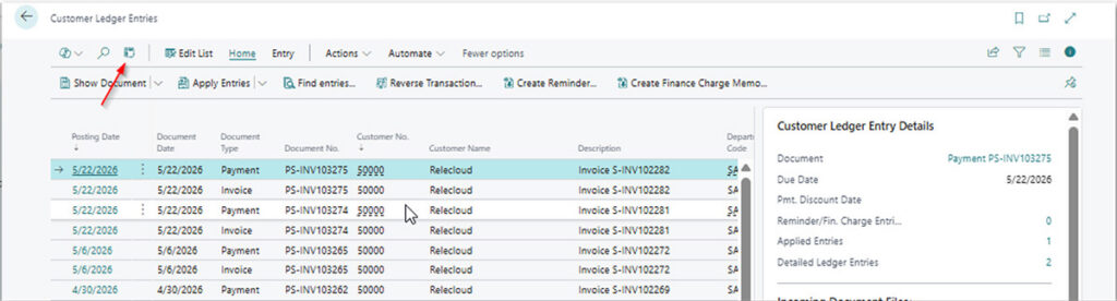
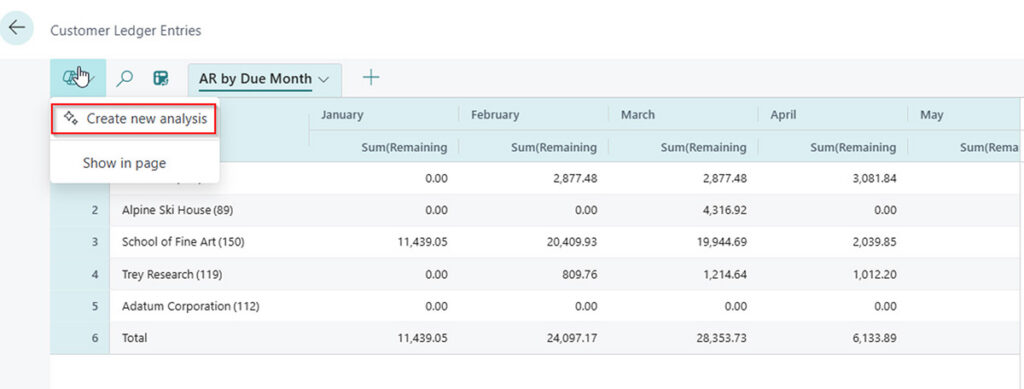
- In the action bar at the top of the page, select Enter analysis mode (the Analyze button).
- The page switches to the analysis workspace, replacing the normal action bar with the analysis bar. The Leave analysis mode button takes you back when you are done.
Step 3: Switch on Pivot Mode and clear the clutter
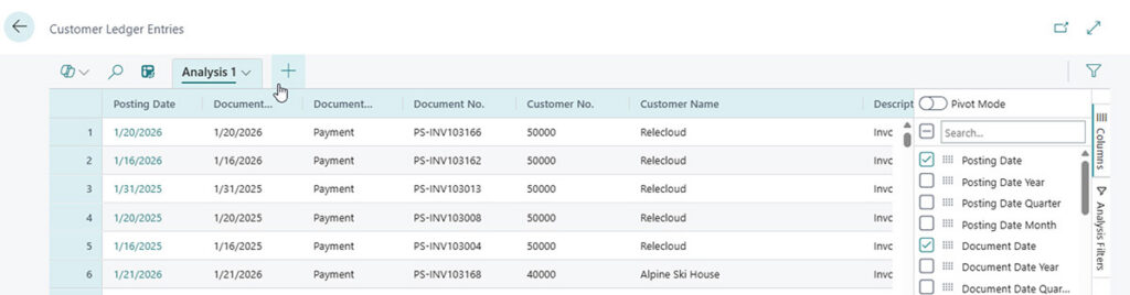
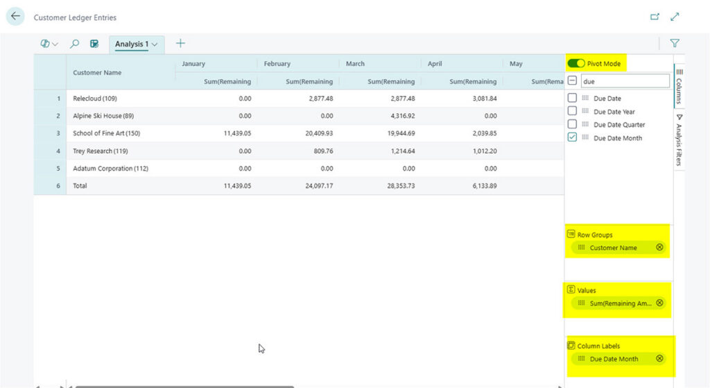
- On the right, turn on the Pivot Mode toggle above the Search field. This unlocks four drop zones: Row Groups, Column Labels, Values, and Filters.
- Clear all columns at once via the checkbox next to Search (a blank canvas beats fighting the default layout).
Step 4: Drop your fields into place
- Drag Customer Name into the Row Groups area. Now every customer is a row.
- Drag Remaining Amount into the Values area. You instantly get the open balance per customer.
- Drag Due Date Month into the Column Labels area. Your balances now spread across the months they are due.
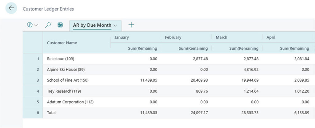
That is it: a live aging-style matrix with customers down the side, due months across the top, and totals on the summary bar. Change a filter, and it recalculates instantly.
Step 5: Save it as a tab
- Double-click the tab name and rename it to something like “AR by Due Month” so it is waiting for you next time.
- Add more tabs beside it, each answering a different question. Tabs persist for your user and never affect anyone else.
Congratulations — you just replaced an Excel export, a PivotTable, and an email attachment with about sixty seconds of dragging.
Five power features that will impress your team
Power feature #1: Use Copilot to build an analysis automatically
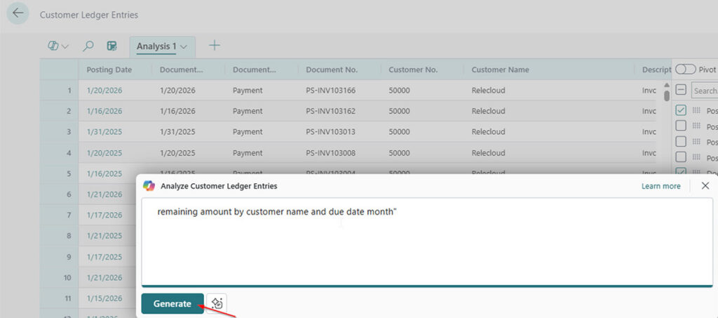
Analysis Mode includes a Copilot capability called analysis assist. Describe what you want in plain language (for example, “show remaining amount by customer and due month”), and Copilot generates a starter tab you can refine by hand. It is the fastest way past the blank-canvas stage and a great demo moment for consultants.
Power feature #2: Analyze related tables without leaving Business Central
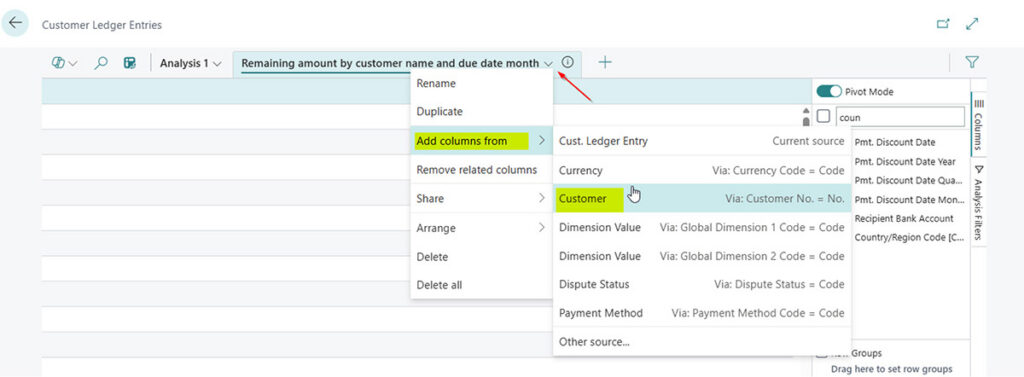
You used to be limited to columns on the current page, which was the top reason people bailed to Excel. Now you can add columns from related tables and group by them. From the Analysis context menu, choose Add columns from, pick a related table (for example, Customer fields while analyzing customers), and the fields appear. Was available as an opt-in in version 26.2, on by default since version 27.
Power feature #3: Use date hierarchies for time-based reporting
Year / Quarter / Month hierarchies let you expand and collapse time periods directly in the pivot instead of building separate date columns. Group by year, then drill into the quarter or month you care about.
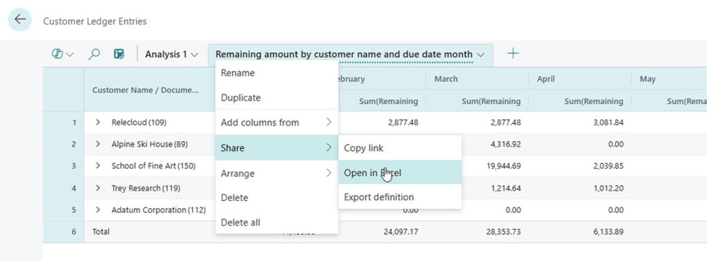
Power feature #4: Share analysis views without exporting to Excel
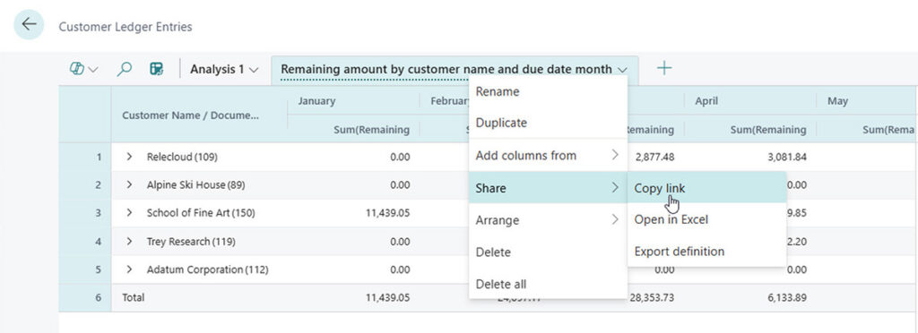
Use the copy-link option to share an analysis with a colleague. They get their own personal copy, and standard BC permissions still apply: nobody sees data they should not access. It is the answer to, “Let me email you the spreadsheet.”
Power feature #5: Export finished reports when needed
When the analysis has to leave the system, copy the grid into Excel or PowerPoint, or export the tab. Unlike a normal export, you are sending a finished answer — not raw rows to wrangle.
Real-world scenarios every finance and ops team cares about
Scenario #1: Customer aged receivables report
Customer Ledger Entries, Customer Name rows, Due Date Month columns, Sum of Remaining Amount — the walkthrough above, answering the most-requested ad-hoc number in most businesses, live.
Scenario #2: Sales by item and month
From Item Ledger Entries or Value Entries, put Item in Row Groups, a posting-date field in Column Labels, and Sales Amount in Values to spot seasonality at a glance.
Scenario #3: Open purchase commitments by vendor
On Purchase Lines, group by Vendor and sum Outstanding Amount to see where your money is committed before it hits the ledger.
Scenario #4: G/L activity scan
From G/L Entries, group rows by G/L Account and columns by posting month, then sum Amount for a fast trial-balance-style scan — no report request required.
Tips and best practices: The expert’s playbook
Pro Tip #1: Start from a cleared canvas
Default columns on big lists are noisy. Clear them first, then add back only what the question needs — pivots build faster and read cleaner.
Pro Tip #2: Mark cells for quick fact-checking
Highlight cells to flag numbers worth revisiting, and read sum, count, average, min, and max off the summary bar — no formulas required!
Pro Tip #3: Use filters per tab, not global filters
Filters inside Analysis Mode belong to the active tab only, which lets your “Overdue only” and “Everything” tabs live side by side without conflict.
Pro Tip #4: Know when to reach for a real report instead
Analysis Mode sits between a raw list and formal reporting that is built for fast, exploratory, answer-it-now analysis. It is not the tool for a fixed, branded layout on a schedule, a report that emails itself monthly, or a governed dashboard the whole organization relies on — those are tasks for Financial Reports, report scheduling, or Power BI. Rule of thumb: if you are about to export to Excel just to add up or pivot a column, stop! Analysis Mode does it faster and with live numbers.
A few gotchas to know about
- It is not on every page — Chart of Accounts is a well-known example. You can usually get the same data from a related entries page (G/L Entries, in that case).
- Some fields are not reachable — if a name or description lives on a table the page does not expose, you may only get the code. Related-table support closes most gaps, but not all.
- Very large lists behave differently — large-dataset mode keeps things responsive at the cost of a few formatting constraints.
Business Central Analysis Mode keeps getting better
Microsoft has enhanced the feature in nearly every release wave. Recent highlights:
- Copilot analysis assistance for natural-language tab creation, with continued enhancements.
- Fields from related tables are enabled by default starting in version 27.
- Year / Quarter / Month date hierarchies for faster time analysis.
- Large-dataset mode for lists exceeding roughly 100,000 rows.
- Tab sharing by link, with Business Central permissions enforced.
Contact ArcherPoint by Cherry Bekaert to learn how you can increase your team’s productivity using Analysis Mode in Business Central for faster reporting, fewer Excel exports, live data analysis, and self-service reporting
Trending Posts
- Login Error: Communication protocol mismatch between client and server
- How to Make Measures Total Correctly in Power BI Tables
- The Microsoft Technology Stack – What Is It & Why Should You Care?
- MRP vs. MPS: Choosing the Right Planning Approach for Your Manufacturing Business
- Designing a Connected Student Engagement Technology Stack
Stay Informed
Subscribe to Communications
"*required" indicates required fields