
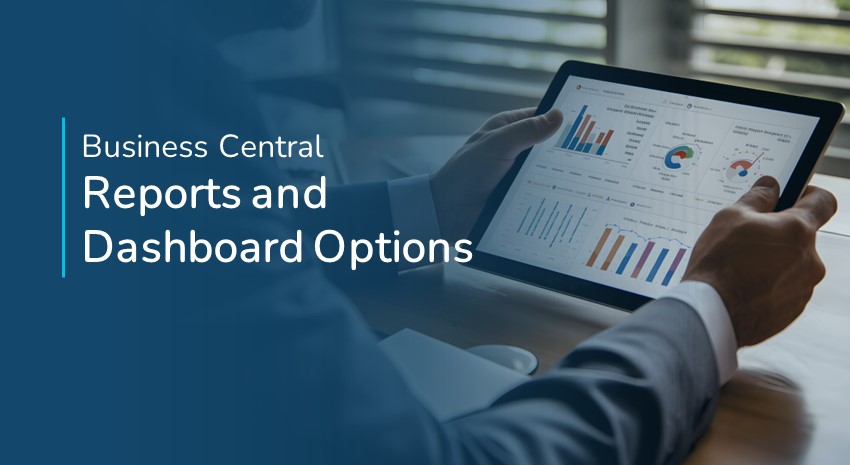
Microsoft Dynamics 365 Business Central Reporting Options
Reporting in ERP systems has changed as Microsoft has reimagined how users interact with data. In Business Central, we are no longer constrained by traditional reporting: write the report, print, and then review. Now, you can review the data you need on your screen and drill into the data on the fly, allowing for faster data-driven decisions.
In this video, we’ll show examples of dashboards, Excel options, analysis mode, the report inbox, and Power BI reporting in Business Central.
- Dashboards allow you to view and drill into the data on your screen.
- Excel allows you to manipulate data and make mass edits using a familiar tool.
- Data Analysis mode is available on any list view screen in Business Central and provides easy access to filtering and grouping data for more meaningful reports.
- The Report Inbox is a place to access traditional reports that can be scheduled to run on your preferred cadences
- Power BI is embedded in Business Central and comes with templates that you can use to create your own custom Power BI dashboard right in Business Central.

Learn more about how to leverage financial reports in Business Central.
Explore Business Central with more How-To videos and our How-To Business Central blogs.
Transcript follows:
Hi, my name is Gwendolyn Stearns with ArcherPoint. Today we’re going to discuss reporting options within Business Central. But first, let’s start with a little bit of a history lesson. Years ago, ERP reporting was very limited. You could basically preview a report to your screen or you could physically print a report and start circling items for follow-up. Over the years, we sort of re-imagined how humans interact with data and technology, and as a result, business Central has a variety of tools that augment or replace your old, printed reports, allowing the user to interact with the data. So let me show you some examples of that. We’re going to cover dashboards, Excel options analysis modes, your report inbox and Power BI reporting. So let’s start with the dashboards. So first of all, let me show you sort of the traditional report. Here. I have my top customer lists.
Okay, let’s look at my top five customers by sales, and I want to see it in a bar chart. Or maybe let’s do a pie chart. So I preview this, and here we have our top 10. I’ve limited to five, and of course I get my sales, my balance, and I get this nice pie chart. Lets me know sort of their slice of the pie, what percentage they make up visually. So again, old school report old. Alternatively, we have dashboards throughout the system that will show us that same data. So rather than sitting down and printing a report and reviewing it, I can actually look at this dashboard. I can hover over their little slice of the pie. I can see their total sales. But the nice thing is now when I see something that looks off, or I just want to investigate, I can actually drill into this customer’s account and now I can go back, and I can see all the invoices that were ever posted for this customer.
We also have Excel options. So, let’s go back here. Let’s go from a financial standpoint. Let’s talk about the balance sheet. So we go to our financial reporting, and we have our balance sheet. Let’s open it up. And again, I’m going to show you the first option, which is just the printing like we normally do. So if we go over here, print right, I’m able to go ahead and preview the report to screen. I have my balance sheet here. Again, I have the data. I can present this to others. It’s fine. Prior to printing that, I do get a little bit of a preview here. It’s the same thing that we just saw on that document. But the nice thing here is that again, if I see something I want to investigate, I can now drill into the system and I can actually get down to the originating document.
So I can just back up here, and I might see something that needs to be changed, make an edit, and then review it rather than printing a document, seeing the problem, then going and drilling through the system. We’ve also got the ability to export this data to Excel. So we saw that pre-formatted document, but we have the ability to sort of format things the way we want to see them. And I’ve got that in Excel. So right now, I’m just going to drag my pre-formatted Excel document, and it’s the way that I want to distribute the data. I just tell which sheet to push the data to. And now let’s open this up and you’ll see here, this is now my balance sheet. And again, now I could go ahead and distribute this and people are seeing things the way that they want to see them. And I’m not having to redo this at the end of every month. I’m just pushing the data data into Excel in a pre-formatted way. Let’s look at another view, another use with Excel. So let’s look at our customer list. So let’s say I realized that when we were setting up our customers, we didn’t include the US on any of our US based customers. So again, I could go to my customer list, I could print this
I’d be able to go through each of these accounts and figure out which one was missing the country code, or I can leverage Excel. So let’s cancel this. Here, we have the ability to edit in Excel. So I can push data to Excel to look at it, but I also have the ability, in this case, I want to go ahead and do my editing while I’m in there. So sort of like I’ve got this online interactive report where I can go ahead and make these changes. So let’s go over to the column with the country in it somewhere down here. Here we go. And I’m able to use a tool I’m familiar with and just say, you know what? Let’s just look at everything that’s blank. Here we go. All right. And we can go through here now. And this one, here we go Blanks. And I can go through here and I can quickly just update all these records using a tool I’m comfortable with, right? It’s all filled in here
And now, I can publish, and I can push that data into Business Central. So I get the tool, the report basically showing me where the data’s missing, but I’m able to make those edits because also I have permission to do so. If I didn’t have permission to make edits within the system, I wouldn’t be able to bypass it by using Excel. But it’s just another way that you can sort of leverage the reporting with the action that you want to achieve. So if I go back to my customer list and I just refresh it, you’ll see now it’s all filled in. While we’re on this list, there’s also an analysis mode. So it’s another tool that is inherent to the system. I’m going to go ahead and click on this analysis mode up here. And it’s taking the data from this list, and it’s just putting it into an analysis view.
Any screen that is a list view has this analysis button on it, and you can use this tool. So let’s first go in and say, okay, we have all these different customers. Let’s go ahead and add a filter. And that filter will be, I want any balance that’s greater than a dollar. And let’s go ahead and just filter that list. So now it narrows it down. Now let’s say I want to start seeing some totals. I see my total rows here. I see the filter value, but I also see over here that I’ve got these different column options where I can group rows. I’m going to group by salesperson, and then I’m going to group within location within that salesperson’s code. So now I see these four salespeople. I get a sum of the sales and the payments, and then if I expand this, I can see these don’t have a location code.
Let’s see, this one does. So we’ve got locations broken out here for Western, and again, I’m getting my sum of sales and payments and I can expand even further. And now I can actually see the customer here undo the analysis view. As I said, anywhere you see a list, you can do this analysis view. Let’s go back to our home screen and let’s just take a look at our report inbox. So we do have the ability to have traditional reports, and those reports can be waiting for us in our report inbox, and we can put those on a cadence. So they all appear every Sunday night. We have a series of reports that are run, and they’re waiting for me on Monday morning, or maybe they’re daily, and they’re waiting for me every morning or quarterly. So we do have the ability to have those reports waiting for us.
If I open this one, again, I have my PDF, but I also have the ability to set up these reports. Let’s just close this in a way that I can interact with them. So the same report, this is the trial balance with budget. So let’s just look that up, trial balance to budget. I’m going to go ahead and put in my date filter and the budget that I want to compare it to, and now I can send it to Excel, but I just put the data in, so there’s no formatting. It will just dump all the data that we just saw in that report into Excel.
And again, now here’s all that data, and now I could start carving through this data and creating my own pivot tables, things like that. Lastly, I want to show you Power bi. So Power BI comes with the system and the ability to create your own Power BI reports and dashboards. Let’s open this up. So this is one of them. This one actually was created, it comes with Business Central, but you could use this as a template to create your own. You could edit it and you can create any reports. So these are interactive, these dashboards. So I have the ability to slice the data by date. In this case, I can look at a specific customer and I can see what they purchased during that date range. I could look at a product type just to see what’s really selling during that date range. If I had more than one salesperson selling at this time, I could see what they sold. But it’s again, another way of visualizing data. And then in this case, you’re able to use the Power BI tool to go ahead and create your Power BI dashboards, and you can just pull them into Business Central. Hope you enjoyed the video. Thanks.
Trending Posts
- Login Error: Communication protocol mismatch between client and server
- How to Make Measures Total Correctly in Power BI Tables
- The Microsoft Technology Stack – What Is It & Why Should You Care?
- MRP vs. MPS: Choosing the Right Planning Approach for Your Manufacturing Business
- Guide to How Manufacturers Can Implement Quality Control Systems Using Business Central
Stay Informed
Choose Your Preferences
"*required" indicates required fields