
Microsoft Power BI Map Visualizations Made Easy

Microsoft Power BI is a powerful tool that allows users to pull real time data directly from Microsoft Dynamics NAV and other sources for analysis and reporting. Included in the analyzation options are two map visualizations that show data by location. These maps are an impactful and creative way to display data. However, sometimes it can be frustrating trying to navigate the map visualizations recognizing your data. You build a Power BI map visualization, but no matter what you do, the map shows your cities in the wrong states or even the wrong countries: the opposite of fun. However, some tips on formatting data can make creating Power BI map visualizations easy and fun.
Map Visualizations and Data Formatting
The map visualizations are very accurate when you have longitude and latitude in your data, however most of us do not have longitude and latitude in our address data; we have city, state/providence, and country. Fortunately, you can use the data you do have to get accurate map visualizations with a little formatting.
To format your data and fix your Power BI maps that are not working, go to the Data view. To get to Data view, click the icon that looks like a table or chart on the left-hand side of the Power BI window.
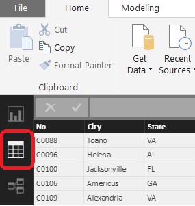
Figure 1 – Data View in Power BI
Highlight each of your location columns one at a time and then click the Modeling tab at the top of the window. Select the drop-down menu for Data type and choose Text.
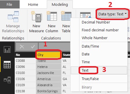
Figure 2 – Data Type in Power BI
Then, use the drop down menu for Data Category and select the appropriate type for your column:
Address, City, State, Country/Region.
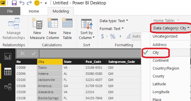
Figure 3 – Data Category in Power BI
Do this for each column of location data you have so the Power BI will recognize it for the map visuals. Sometimes this alone will fix your mapping issues depending on the variety of data. If this does not fix your Power BI mapping issues, you can add a column.
Still in the Data view screen, select the Modeling tab at the top of the Window and click New Column.
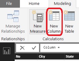
Figure 4 – Adding a Column in Power BI
In the formula bar, you can delete out the word Column and replace it with the name for your new column such as Location. After the equal sign, you will concatenate your City, State, and County columns to form one line with all of the information the map needs. In this example, I have added a comma and space between my values so that it reads nicely:
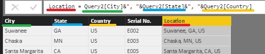
Figure 5 – Location Column in Power BI
Note: If you have a variety of countries in your data set and you use abbreviations for these countries, Microsoft recommends using the approved three-letter country abbreviation to ensure accuracy.
Now when using a map visualization, you can select this new Location column and place it in the Location field of the visualization and your map will show the accurate placement of your data.
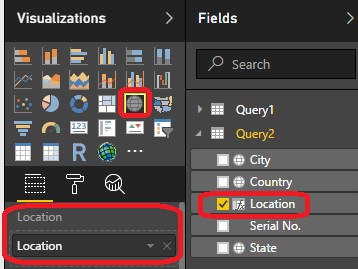
Figure 6 – Location Field in Power BI
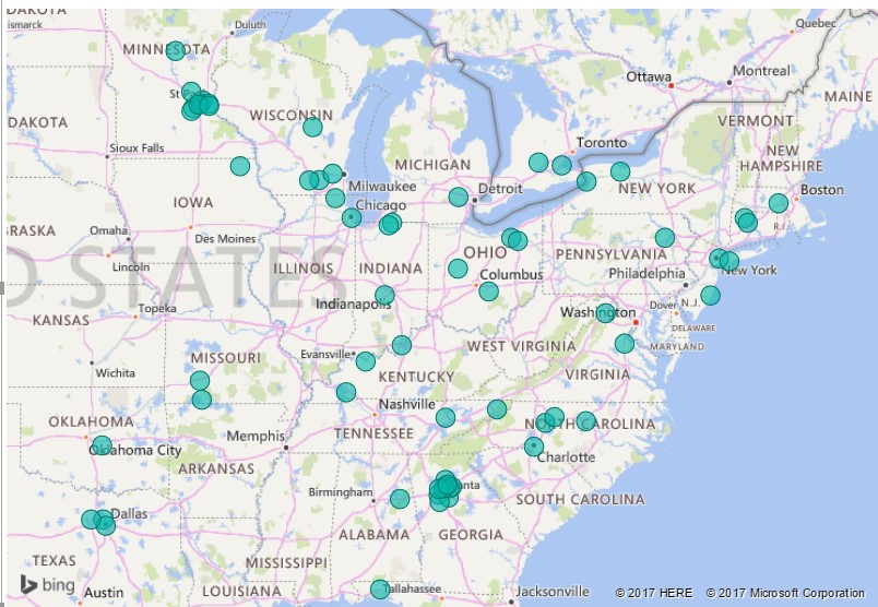
Figure 7 – Power BI Map
If you would like to learn more about using Power BI to analyze data and build reports using your Microsoft Dynamics NAV system, please contact us via webform or by emailing emartin@archerpoint.com. We have a team of consultants ready to help with your next Power BI project.
For more information on Power BI, Map Visualizations, and other tools to enhance your experience with Microsoft Dynamics NAV, please visit our resource center and be sure to subscribe to our blog.
Trending Posts
- Login Error: Communication protocol mismatch between client and server
- How to Make Measures Total Correctly in Power BI Tables
- The Microsoft Technology Stack – What Is It & Why Should You Care?
- MRP vs. MPS: Choosing the Right Planning Approach for Your Manufacturing Business
- Guide to How Manufacturers Can Implement Quality Control Systems Using Business Central
Stay Informed
Subscribe to Communications
"*required" indicates required fields