
Navigating and Optimizing Power BI for More Effective Reporting

Microsoft Power BI is a reporting and analytics tool that can analyze data from a myriad of sources, including Microsoft Dynamics NAV, Excel, Google Analytics, social networks, APIs, Odata feeds, and more. Power BI allows for creation of interactive KPIs, charts, graphs, matrices, and other visuals to product unique and meaningful reports you can use to understand your business in real time. If you are new to Power BI—or if you’re looking for some best practice—the following guide will walk you through the basics of navigating reports and visuals, filtering the data, asking questions of the reports, and much more.
Navigating Power BI Reports: Getting Started
To access Power BI as part of your Office 365 account, open your browser and log in to Office 365, then select the menu icon in the top right of the browser window and select Power BI.
Figure 1 – Microsoft Office 365 Menu
![]()
Figure 2 – Microsoft Power BI icon in the Office 365 menu
When Power BI opens, select Shared With Me or Workspaces on the left side menu to access your reports or reports that have been shared with you.
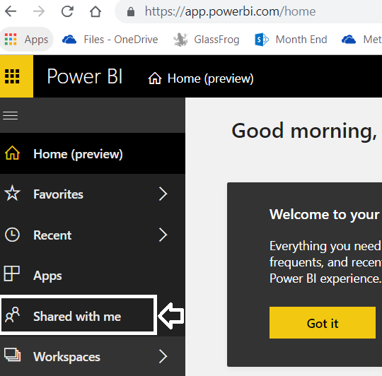
Figure 3 – Select “Shared with me” from the Microsoft Power BI side menu
Viewing Power BI Dashboards and Reports
Once you are in Power BI in your Workspaces or Shared With Me lists, you can select the Dashboard or Reports view of the reports with which you want to interact.
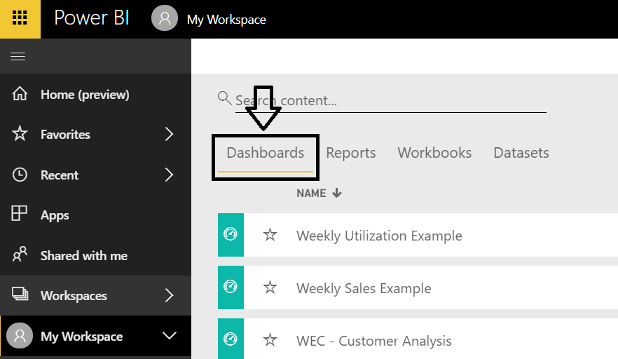
Figure 4 – Select “Dashboards” from the Microsoft Power BI workspace
If you select from the Dashboard list, you can view a report or items on a report and scroll down to see more pages of the Dashboard. Dashboards can be the entire report or only specific visuals from a report. The Dashboard view allows for some filtering, depending on how the report has been set up, but often there are limitations or no filtering available. If you want to use filters for a fully interactive experience, click the report name in the top left corner of the Dashboard to be taken to the Report view, which enables all filtering capabilities.
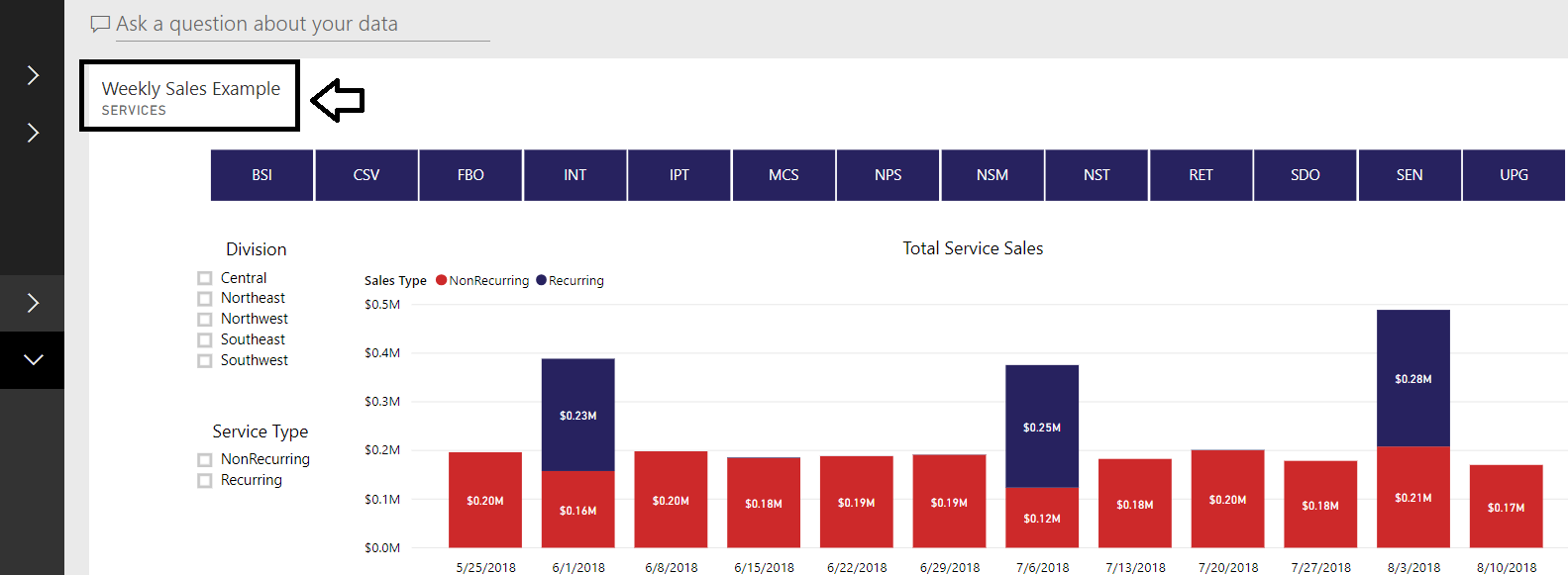
Figure 5 – From the Microsoft Power BI Dashboard, click on the report name to view and filter
You can also return to your Workspaces or Shared With Me list and select the Reports list to access the Report view. In the Report view, instead of scrolling down to see all pages of the report, you will see tabs at the bottom of your screen to select for each page. This view allows for filtering and more interaction with the visuals.
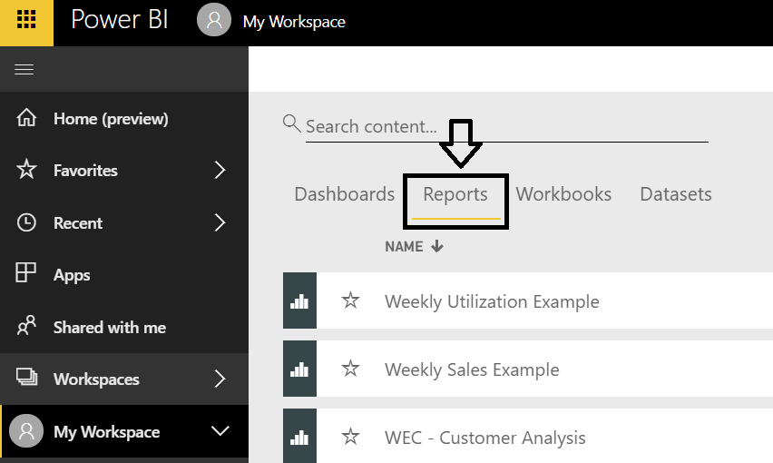
Figure 6 – To view a page in a report in Microsoft Power BI, use the Reports tabs
Filtering in Power BI for Meaningful Reports
Part of what makes Power BI a great reporting tool is that the reports have interactive filtering. In either the standard Dashboard view or in Report view, you as the end user control the filters for the data. Reports have buttons and toggles to filter the graphs and tables displayed.
Many Power BI reports require you to interact and use the filters for the graphs and visuals to be meaningful; without selecting a filter on some reports, there is too much data displayed or totaled to be useful. For example, the following graph shows the utilization for all resources at once…not very helpful without filters.
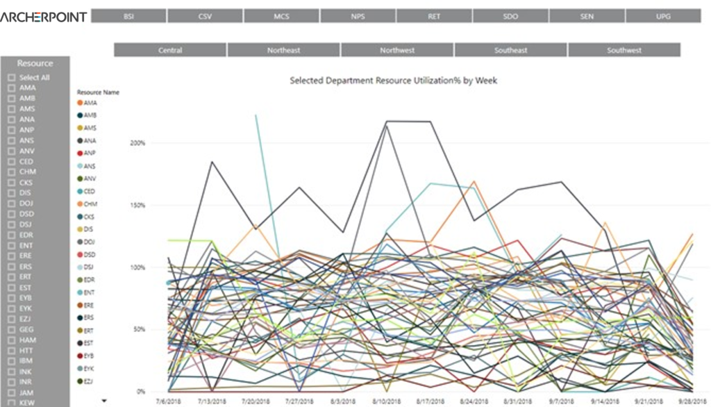
Figure 7 – A Microsoft Power BI report with no filters—not helpful!
However, when you filter it, you get clear results showing trends for comparison.

Figure 8 – A Microsoft Power BI report with filters—clear, actionable results
To filter a chart or visual, you can click buttons, toggle boxes, or even the visual itself. On the report shown here, you can select the blue buttons to filter the graph by Department.
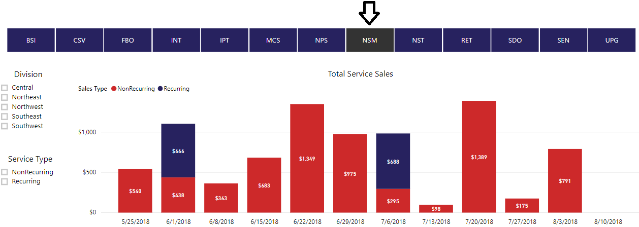
Figure 9 – A visual in Microsoft Power BI filtered by Department, accomplished by clicking a button
Or you can check a toggle box to filter the graph by Division.
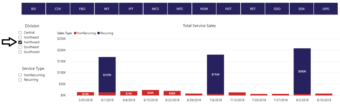
Figure 10 – A visual in Microsoft Power BI filtered by Division, accomplished by checking a toggle box
You can use multiple filter options to show different combinations. In the example below, the filters are set for the graph to show the Nonrecurring service sales for the CSV Department in the Northwest Division.
Figure 11 – A visual in Microsoft Power BI with multiple filters set
Graphs and visuals themselves can also act as filters when you click items inside the visual. Notice how clicking the Recurring (blue) section of the column in the graph also filtered the Total Services Sales by Department table below it.
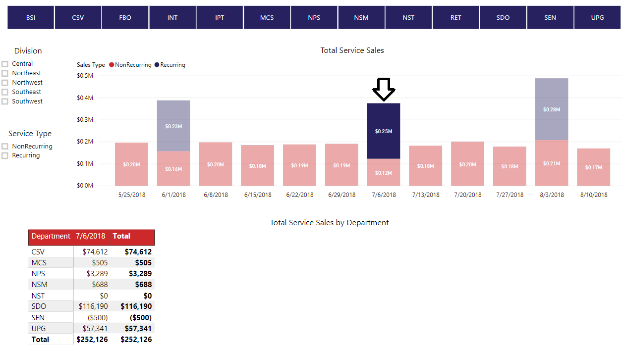
Figure 12 – A graph or visual in Microsoft Power BI can also act as a filter; just click on an item in the visual
If you hover over a graph or visual, an information box will appear and give you the details of that portion of the graph.
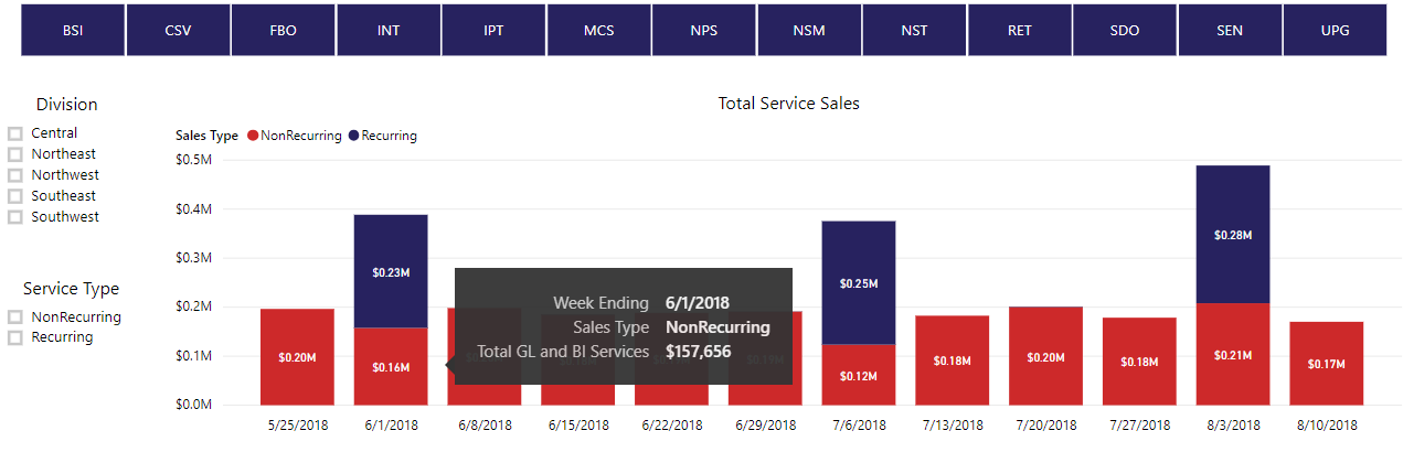
Figure 13 – Hover over a specific area within visual in Microsoft Power BI to get the details of that area
To clear filters, unclick your selections or refresh your browser window. If you are in Report view click the Reset to Default button in the top right to clear your filter selections.
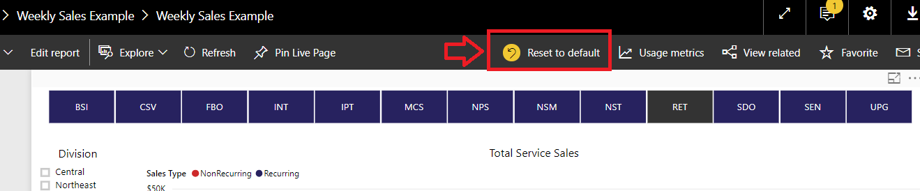
Figure 14 – To clear filters in a Microsoft Power BI visual, unclick selections or refresh your browser window
In Report view, you will see a Filters bar minimized on the right side of the screen. These are the filters applied in the development environment for the Power BI report and if you change them the report will not function as intended. If you have changed them by accident, click the Reset to Default button or refresh your browser window.
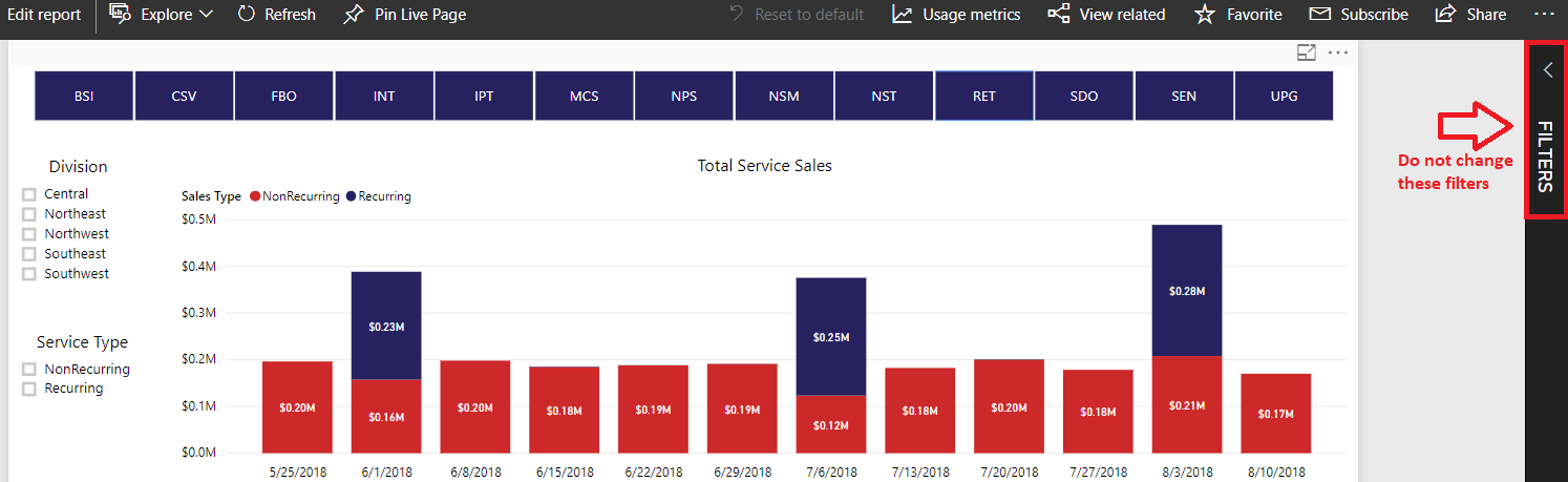
Figure 15 – The Filters bar on the side of a visual in the Report view in Microsoft Power BI contains filters applied that should NOT be changed
Using Focus Mode in Power BI to Help with Hard-to-Read Visuals
Charts and visuals sometimes contain many lines of data or are small and hard to read, especially if being viewed on a small screen. You can enter Focus Mode on any visual to enlarge it to fill the screen for better viewing. Make sure you are in the Report view, then set the filters and parameters as you wish and select the visual or table you want to zoom in on. When you select the visual, icons appear in the top right corner of the visual’s box. Select the Focus Mode icon ![]() and the visual will expand to fill the screen.
and the visual will expand to fill the screen.
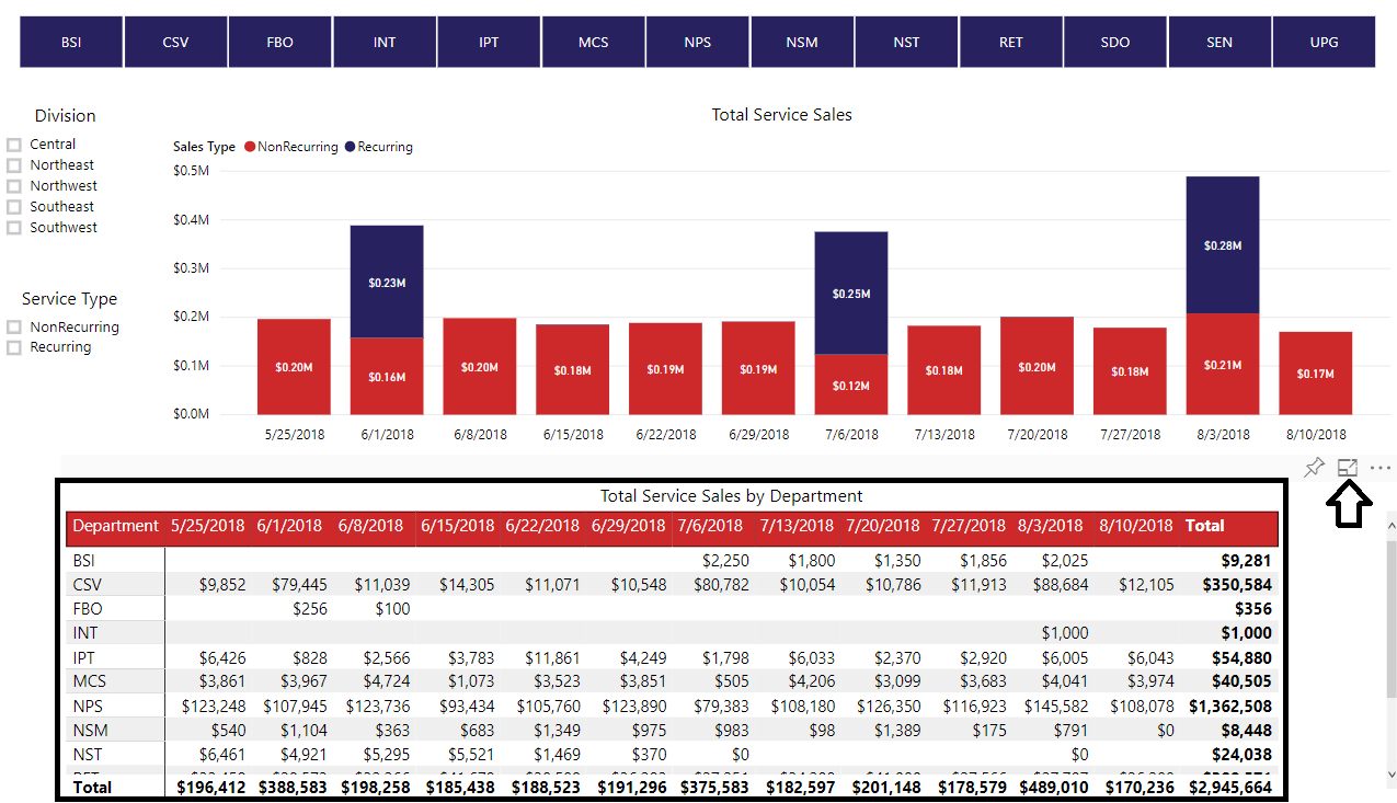
Figure 16 – To get a better view of a visual in Microsoft Power BI, use Focus Mode
In Focus Mode:
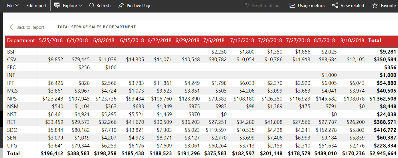
Figure 17 – A view of a visual in Microsoft Power BI after using Focus Mode
To return to the full report, click the Back to Report button at the top left of the Focus Mode window.
Exporting Data from Power BI into Excel, CSV, and More
Power BI allows you to export the data from reports into Excel or as a CSV file if you have a desire to look at the information in a table in a different way.
To export data from a visual or table in Power BI, you must be viewing the report in the Report view. Once in Report view, select the visual or table you want to export. Be aware: The filter buttons and toggles will not apply to your exported data. When you select the visual, icons appear in the top right corner of the visual’s box. Select the ellipses (…) icon, then select Export Data.
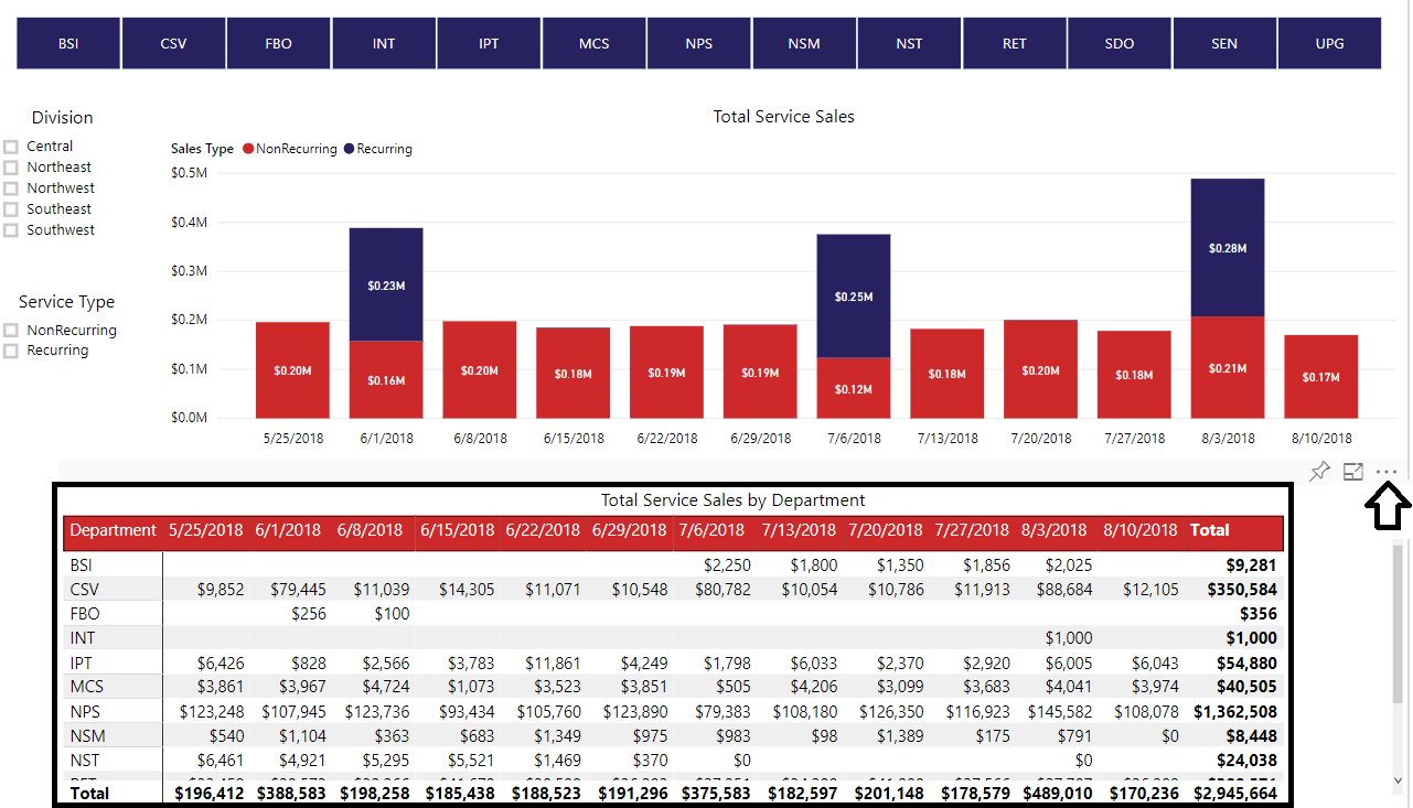
Figure 18 – To export data from a Microsoft Power BI report, visual, or table, view the report in Report view, select the ellipses icon, then select Export Data
The Export Data window will open. Select Summarized data and then select the File Format you wish to use Excel or CSV. Click Export, and the file will be created and downloaded for you to view.
Exported data will be in Excel in a table you can filter, sum, or use any other Excel functionality with. The filters displayed at the top of the Excel sheet are not from the filter buttons you might have selected on the Power BI report, as those do not carry over to the exported data. The “Applied filters” text in your export refers to the filters set up in the development environment for the Power BI visual.
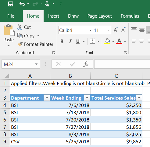
Figure 19 – Data exported from Microsoft Power BI into Excel
Asking Questions About Reports in Power BI
Power BI has a natural language query that allows you to ask a free-text question about the data in a report and receive an answer. However, this functionality can be very hit or miss, depending on the development and setup for the report. When using this feature, use words that are common for financial reporting and/or words that appear in the report itself.
In Dashboard view, you’ll see an icon to Ask A Question About Your Data in the top right corner. Click the icon and you’ll be taken to the Q&A window.
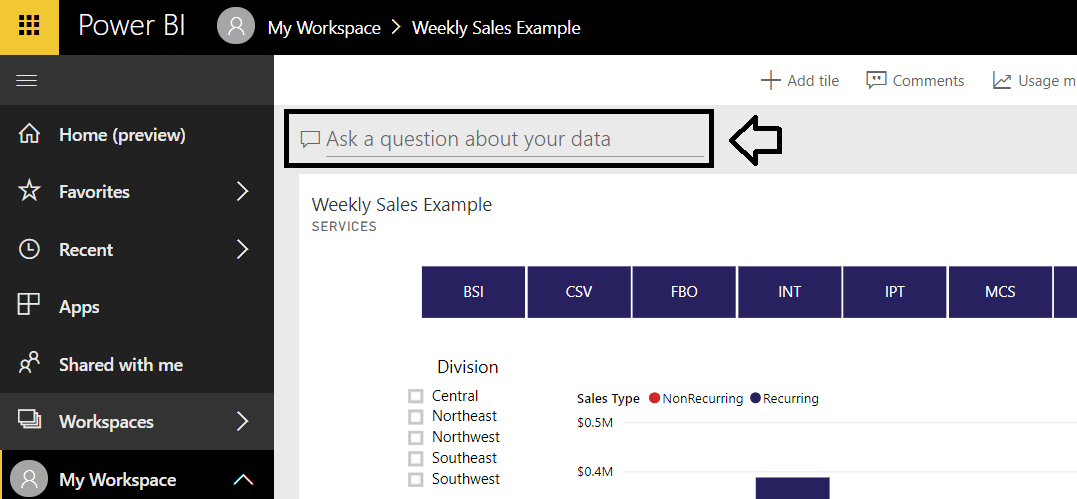
Figure 20 – Ask A Question feature in Microsoft Power BI, in Dashboard view
In the Q&A window, type your question or a phrase about the report data in the Ask A Question About Your Data box, and an answer will appear.
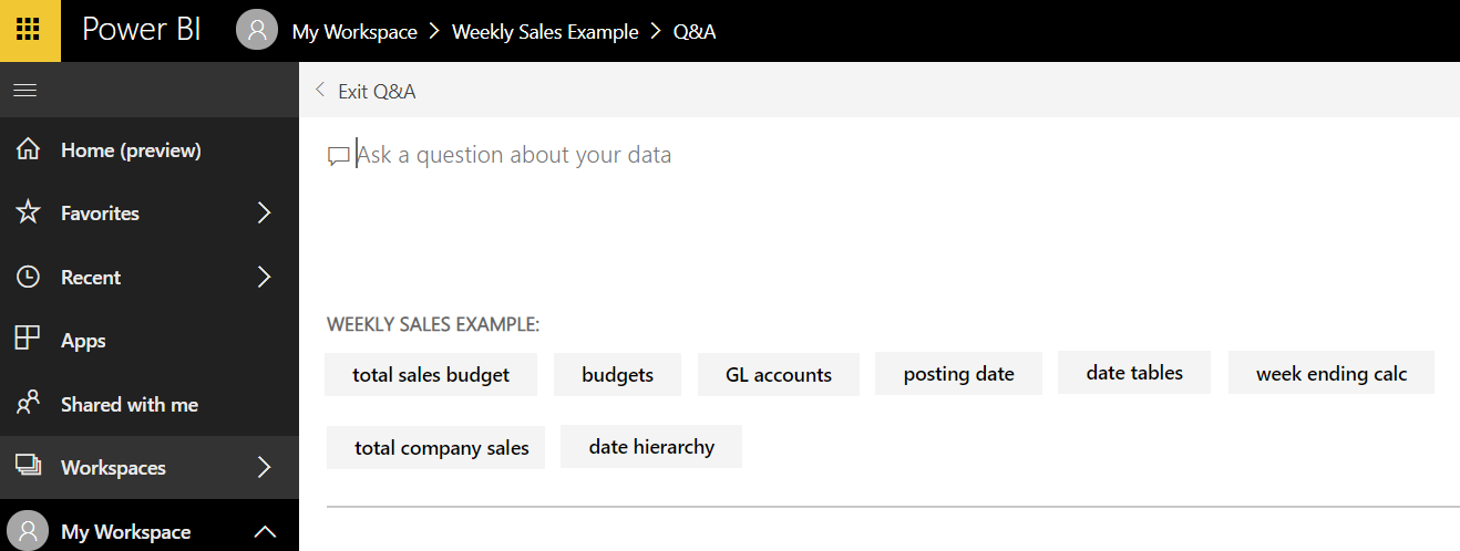
Figure 21 – To ask a question in the Ask A Question feature in Microsoft Power BI, type your question into the Q&A window
Results can be a number or a filtered visual, depending on what you type in. The quality of the results varies depending on the naming and setup used for the report’s development and the raw data behind it. As you type in the Q&A Ask a Question box, you will see that Power BI will suggest data names and filters for you. Use these suggestions to get better matches for your queries. Any words in your inquiry that Power BI has suggestions for will be underlined in yellow. You can also click the gray suggestion buttons at the bottom of the window to use as your inquiry.
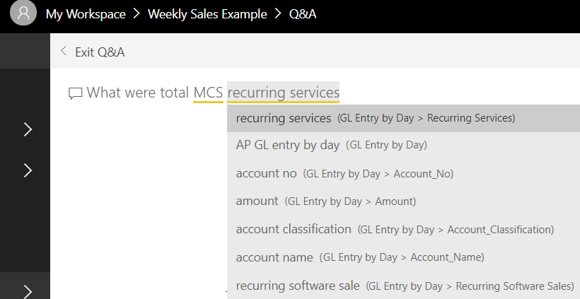
Figure 22 – Example of suggestions offered in the Ask A Question feature in Microsoft Power BI
Here are two examples of a Q&A result, one where a chart is provided in response to the inquiry and one where a total amount is provided. If you are struggling to get good results from the Q&A, try using the drop-down suggestions offered by Power BI as you type in your inquiry.
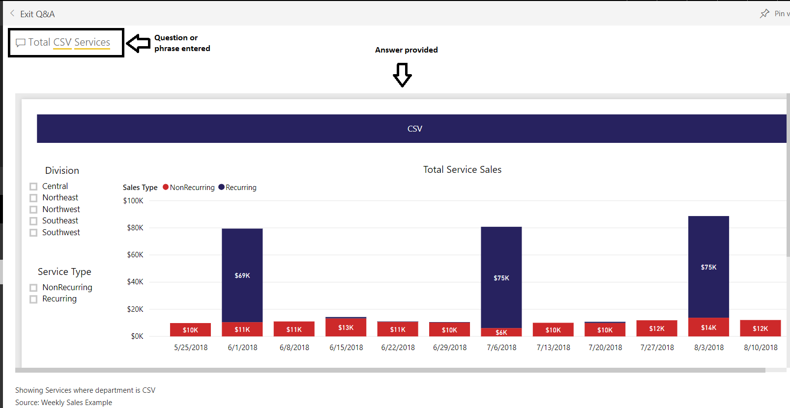
Figure 23 – Ask A Question result in Microsoft Power BI, presented in the form of a chart
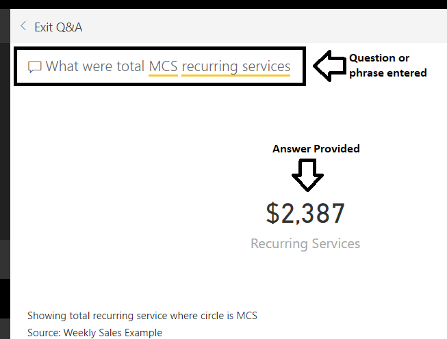
Figure 24 – Ask A Question response in Microsoft Power BI, presented as a number/amount
Subscribing to See Power BI Reports on a Regular Basis
If there is a Power BI report that you want to see on a regular basis, instead of visiting SharePoint or Power BI every day, you can have a snapshot of the report emailed to you. You can subscribe to get an emailed picture of the entire report or just one page of the report. The email will be an image of the report only, if the report requires filters, you will still need to view the actual report in Power BI as the emailed snapshot is not interactive.
To receive an email subscription of the entire report, in the Dashboard view of the report, select the Subscribe envelope icon in the top right corner to open the Subscribe options.
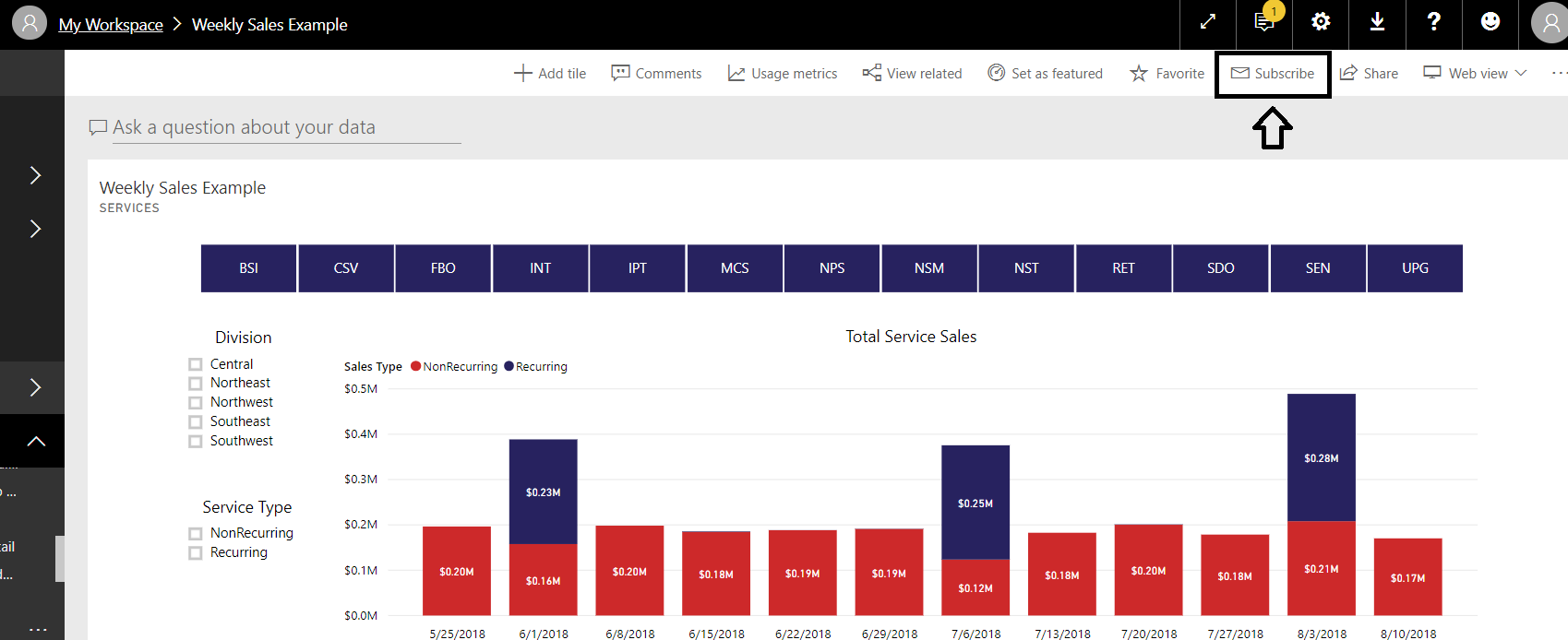
Figure 25 – To receive an email subscription of a report in Microsoft Power BI, use the Subscribe feature
In the Subscribe to Emails window, make sure the toggle switch is set to On (you can unsubscribe from reports by switching this toggle to Off). Fill in the subject for the email subscription so you will recognize it in your inbox, and if you like, you can include a message. Click Save and Close at the bottom. You will then receive an email of the report when the report is updated.
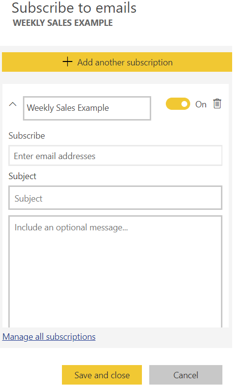
Figure 26 – Form for subscribing to emails in Microsoft Power BI
To receive an email subscription of only one page of a report, go to the Report view (click the report name in the top left corner of the Dashboard view to be taken to the Report view) of the report you want to subscribe to, select the tab of the page you want to subscribe to, and then select the Subscribe envelope icon in the top right corner to open the Subscribe options and fill in the Subscribe to Emails window.
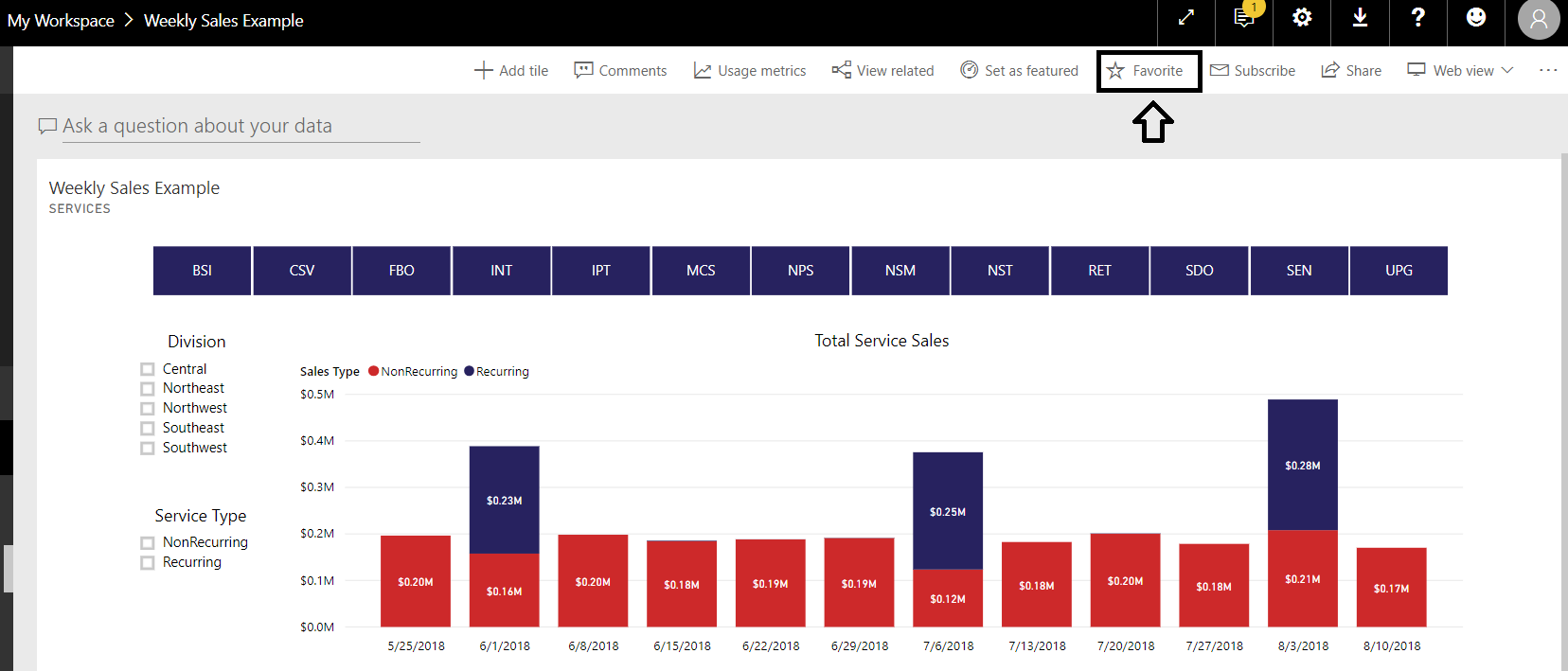
Figure 27 – Use the Favorites feature in Microsoft Power BI for reports you want to see on a regular basis
NOTE: Once Favorited, the star icon next to the report will turn yellow.
To access your favorite reports, select Favorites on the left side menu, and you’ll see a list of the reports you have saved. If you save a report in Dashboard view as a favorite, you will see a gauge icon next to it. If you save a report in Report view as a favorite, you will see a bar chart icon next to it.
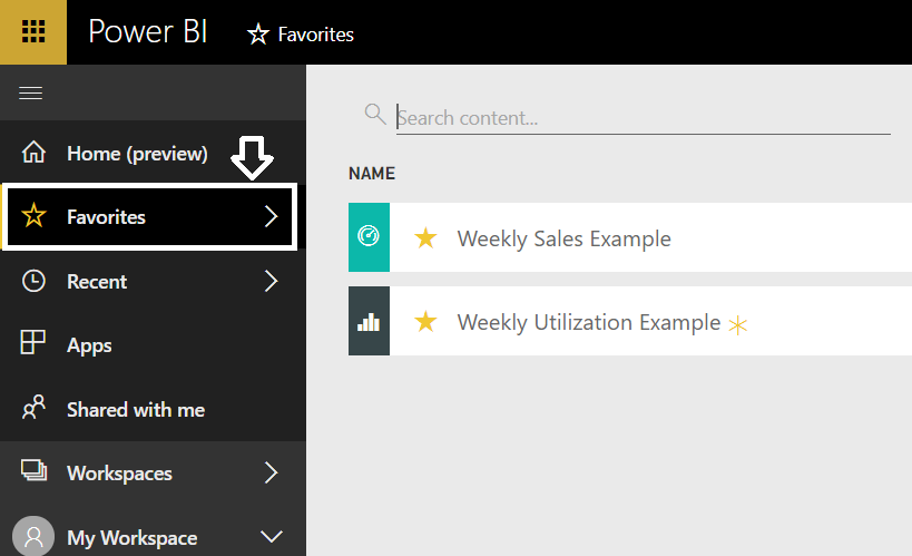
Figure 28 – Viewing a list of favorite reports using the Favorites feature in Microsoft Power BI
Taking Advantage of Additional Power BI Resources
Power BI is a versatile tool that provides great insights into your data. If you would like to learn more about how Power BI can help your business, please reach out to us, we have Power BI certified consultants that would be happy to help! If you are interested in learning more about the Power BI community, check out the Power BI User Group. To learn more about Power BI, visit Power BI blog posts or Microsoft’s Power BI guided learning page or contact ArcherPoint for assistance with your Power BI needs.
Trending Posts
- Login Error: Communication protocol mismatch between client and server
- How to Make Measures Total Correctly in Power BI Tables
- The Microsoft Technology Stack – What Is It & Why Should You Care?
- MRP vs. MPS: Choosing the Right Planning Approach for Your Manufacturing Business
- Guide to How Manufacturers Can Implement Quality Control Systems Using Business Central
Stay Informed
Subscribe to Communications
"*required" indicates required fields