Power BI Formatting Issues Resolved
Microsoft Power BI is an amazing tool. It allows me to build reports that update with real-time information from our ERP system, Microsoft Dynamics NAV, so that all of our team members can access information about financials, projects, cash flow, and various statistics in one click. However, Power BI is anything but perfect, especially when it comes to formatting.
Who among us hasn’t been frustrated because the map visualizations will not display correctly? Sales amounts show too many decimal points in a Power BI table? Dates display in long format or won’t work in Power BI tables or filters? We have all been there. However, there are some simple solutions to these vexing Power BI formatting issues.
Many of the issues that occur when building a Power BI report are due to the format of the data coming in from Dynamics NAV (or whichever data source you are using). You can format your data in the Data view or in the Query Editor. To make things similar, this blog will focus on using the Data view to format information.
Data View and Type
Once you enter your data source using the Get Data function, click the Data view icon that looks like a table or chart on the left-hand side of the Power BI window.![]()
Figure 1 – Data View Icon in Power BI
Here you can massage your data by filtering and setting the Data Type. Once you have removed any columns you know for sure you won’t need, then move to using Data type. Go through each column and set the Data type if the information is different from what Power BI has set as the default. Highlight a column and then click the Modeling tab at the top of the window. Select the drop-down menu for Data type and choose the appropriate category. When setting the Data type on a column you will often get a warning asking you to confirm, select Yes.
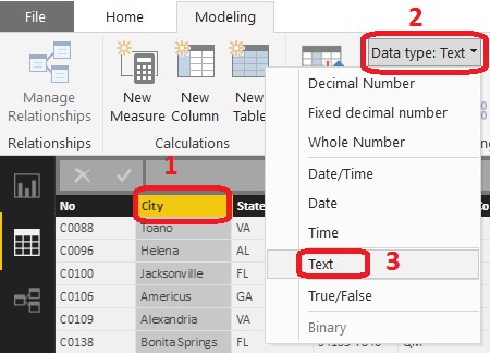
Figure 2 – Data Type
If you have set the Data type to a number, select the Format drop down. If you have set Data type to text, skip the Format option and go to the Data Category option. For Format, use the drop-down menu, select the format you would like your data displayed in. For example, you can format a number as currency and then use the buttons below the Format drop down to set the currency symbol and decimals displayed.
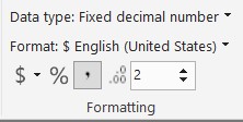
Figure 3 – Format Options
If you use the Data type of Date, Date/Time, or Time for a column, you can use the Format drop down to select how you want it displayed as well.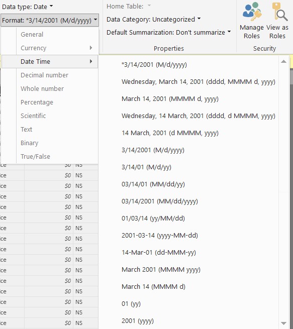
Figure 4 – Date Options
If you have a Data type of Text, use drop down menu for Data Category and select the appropriate type for your column. If you want to utilize any of the mapping visualizations that Power BI has to offer you will need to use the location Data Categories on your data.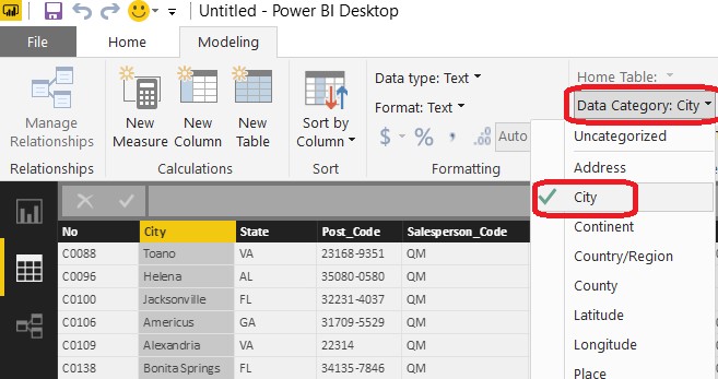
Figure 5 – Data Category
Once you have formatted all of your columns, you are ready to build visualizations that display data in the form you want.
If you would like to learn more about using Power BI to analyze data and build reports using your Microsoft Dynamics NAV system, please contact our team at info@archerpoint.com. We have a team of consultants who are happy to help with your next Power BI project!
For more information on Power BI, report formatting, and other tools to enhance your experience Microsoft Dynamics NAV, please visit our resource center and be sure to subscribe to our blog. Look for next week’s blog on Power BI Mapping.
Trending Posts
Stay Informed
Choose Your Preferences
"*required" indicates required fields
