
Creating Revenue Charts Using NAV Finance Performance Charts

This blog explains how to use Microsoft Dynamics NAV Finance Performance charts to create a revenue chart that you can display in your role center. The example in this blog uses the Cronus Demo.
NOTE: Finance Performance charts are based on account schedules, so you will need to have existing account schedules. If you need help setting up a revenue account schedule, read this blog.
First things first. To use the Finance Performance charts, you must be using one of three profiles: Accounting Manager, President, or President-Small Business. It is not available to any other profile role.
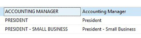
Figure 1: Profiles that can use Finance Performance
Next, you may need to add Finance Performance to your role center by customizing the page as it is typically not visible by default.
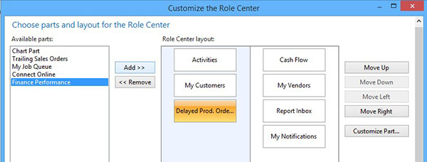
Figure 2: Add Finance Performance to your role center.
Now that the Finance Performance is visible on your role center, click the Select Chart button which brings up the Account Schedule Chart List then click New.
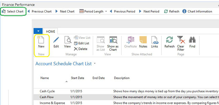
Figure 3: Select Chart (circled in green) then click New (circled in yellow)
Next, name your chart. In this example, it is named “Revenue” with the Description of “Revenue Chart”. In the Account Schedule Name drop down, select the Account Schedule on which you will be basing your chart. In this case, the chart being used is Revenue.
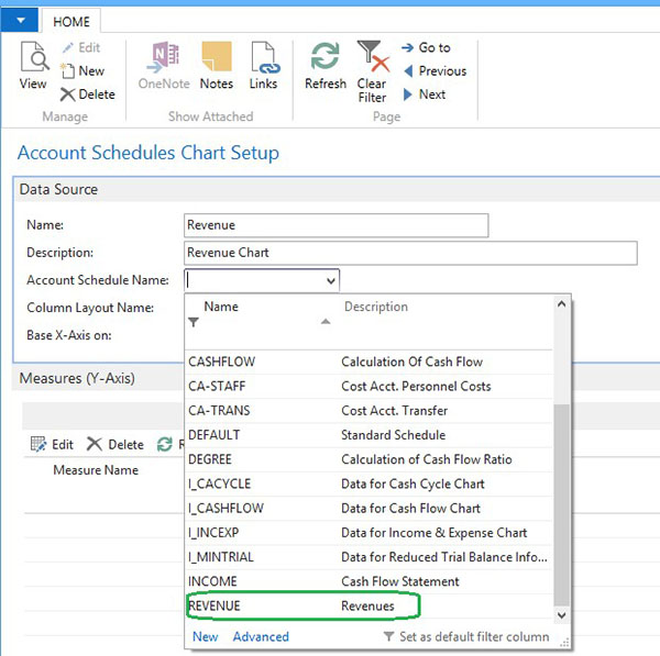
Figure 4: Name the chart and select the Revenue Account Schedule Name.
After selecting Revenue, the Column Layout Name should default based on how the Account Schedule is set up, but you do have the option to choose a different layout. In this example, it defaults to BUDGANALYS. The Base X-Axis has been left as Period since that is what we want our X-Axis based upon in this example. Based on your selection, some of the other fields may or may not become available. For example, since Period has been selected, the End Date field is not available. Enter a starting date, Period Length, and No of Periods you want on your chart. In this example, the start date is 01/01/16 with the period length set as Month and 12 as the number of periods.
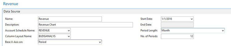
Figure 5: Fill out the Data Source information.
Next, fill out the Y-Axis measures you want the chart to display. To do this, select Edit.
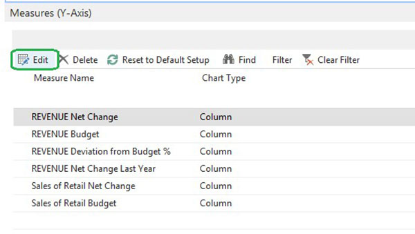
Figure 6: Y-Axis Measures.
After clicking Edit, the Acc. Sched. Chart Matrix will display. Select what information you want displayed and how you want it displayed. In this example, the Net Change and Budget of Sales Retail–Dom and Sales Retail-EU have been selected to be displayed as columns and the Revenue Total as lines. You have options in the drop down on how you want the data displayed (line, column, etc.).
Note: Only a total of six measures can be used for the chart.
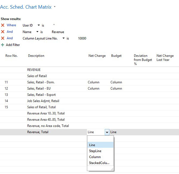
Figure 7: The Acc. Sched. Chart Matrix is used to set which data and how it is displayed.
After that, press OK until you get back to the role center, and your Revenue chart should be displayed. In this case, the chart shows the 12 months on the X-axis and displays the Sales Retail Dom and EU as columns and the totals as lines.
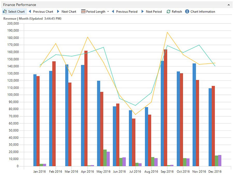
Figure 8: Revenue Chart.
Do you have questions about other functionality in Dynamics NAV? Contact ArcherPoint; we’ll be happy to help you find the answers.
For more step-by-step instructions on how to perform specific tasks in Microsoft Dynamics NAV, see our collection of How-To blogs.
Trending Posts
- Login Error: Communication protocol mismatch between client and server
- How to Make Measures Total Correctly in Power BI Tables
- The Microsoft Technology Stack – What Is It & Why Should You Care?
- MRP vs. MPS: Choosing the Right Planning Approach for Your Manufacturing Business
- Guide to How Manufacturers Can Implement Quality Control Systems Using Business Central
Stay Informed
Subscribe to Communications
"*required" indicates required fields